How to Build Your Own Sovereign Colour Palette
(Without Following the Rules)
Before you were taught the rules of colour- Warm, Cool, Summer, Winter – What does colour mean to you?
Do you think of it as more than a tool? Does it show your mood, identity, beliefs or the real you?
These are the things, the mainstream fashion, influencers, and social media have made us forget.
Some people think of colours as trivial things. But knowing how colours shape your life, your dressing from the inside-out, and your environment is a must to learn.
You must have read the seasonal colour theory somewhere on the Internet. But wearing that specific defined range of seasonal colours your whole life, when the world has so many beautiful hues- Does nature even recognise such a rigid rule?
Of course not.
This is not another guide designed to fit you in a box. Instead, this is an invitation to build your own system. Together, we will explore the true meaning of ‘looking good’ in a colour, learn the practical foundations of undertones and contrast theory, and then, most importantly, we will break the rules. We will delve into the psychology behind why certain hues make us feel powerful, and by the end, you will have a clear, step-by-step ritual for creating something that no chart can give you: your own Sovereign Colour Palette.
2. What Does “Looking Good” in a Colour Really Mean?
Colours aren’t just for looking good; there is a deeper meaning behind them. It has more to do with reason than with rules.
Colour doesn’t have a universal meaning for everyone. You could feel grounded in green, and he (the one you’re texting back) still thinks it looks like mint-chocolate-chip.
This isn’t just a vague feeling; there’s a science to it. The symbolic meaning and physical experience of our clothes can change how we think and feel. The stimulating effect of red isn’t magic; it’s your brain processing the colour’s long wavelength and its deep biological associations—ripe fruits, fire, attention. The calming effect of blue is linked to its shorter wavelength; our brain has to work less, and thereby, the calm rush is created by seeing the sky, the ocean.
And sometimes, you love a particular colour simply because you have a memory tied to it. I have my own story with the red.
I always feel really good in any red dress or top. There was this red T-shirt I had during school, and every time I wore it, I felt seen. My face would glow, and I seemed a little more put together, even though my style was a mess back then. I even got a few compliments for it. That one T-shirt kind of changed the way I think about red now.
That experience is the soul of our work. That t-shirt wasn’t just “flattering.” It was my first unconscious act of Emotional Styling. The colour provided the external energy that aligned with my desired internal feeling: to be seen. Your wardrobe is also full of these stories. Our mission is to learn how to read them.
3. The First Step: How to Identify Your Skin’s Undertone
To master the colours, you first have to learn the foundation. Undertone and Contrast are the pillars.
- The Vein Test: In natural light, observe the veins on your wrist. Predominantly green veins suggest a Warm undertone (with hints of yellow/gold). Predominantly blue or purple veins suggest a Cool undertone (with hints of pink/blue). A mix of both points to a Neutral undertone. A subtle greenish cast to the skin itself is the signature of an Olive undertone, a beautiful and distinct category of its own.

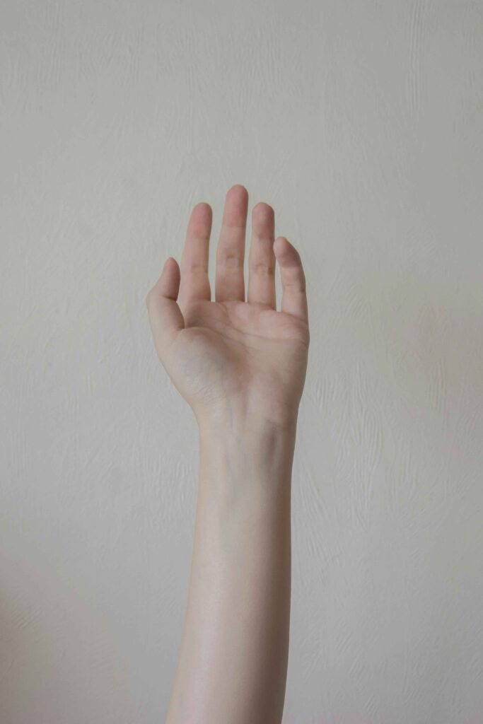
- The Jewellery Test: Does polished silver illuminate your skin? You likely lean cool. Does rich gold make you glow? You likely lean warm. Neutrals often find harmony in both, while Olives may gravitate towards muted or antique metals.
Now, let’s look at the colour palettes these tones usually match with:
- Warm undertone: reds, oranges, earthy colours like browns
- Cool undertone: pinks, blues, greys, whites (and similar)
- Neutral undertone: almost all colours can work
- Olive undertone: earthy greens, muted tones work best
Do you think you are boxed nowLike all your favourite colours got taken away and put into the “wrong” category? Think of Zendaya, Sonam Kapoor, Rihanna, do they follow these rules? No, because true style is bigger than a colour chart. The understanding of fit, fabric, confidence and clever styling is far more powerful than those style rules.
If you are still a lover of colour charts, you can still wear any colour. The key isn’t to banish colours, but to be clever about how you use them. Here are a few ways to think about it:”
Wear it Away From Your Face.
A colour’s power over your complexion shrinks with distance. A vibrant skirt or a great pair of trousers lets you enjoy the colour without having it right next to your skin.
Let a Scarf or Necklace Be Your Shield.
A scarf or statement necklace in one of your best colours creates a protective buffer. It draws the eye and sets the tone, while the “wrong” colour in your top just plays a supporting role.
Anchor it with a Neutral.
That “difficult” colour suddenly looks incredibly chic when grounded by a classic you trust. Think of your creams, navys, or charcoals as the solid foundation that lets a brighter colour feel intentional.
Find it in Print.
Sometimes a colour that feels like too much on its own is perfect when it’s part of a team. A print that mixes the new hue with some of your core palette colours makes it feel instantly wearable.
Frame it with a Jacket.
A blazer or cardigan in a core neutral acts like a picture frame, letting just a sliver of an adventurous colour peek through. It’s a hint, not a shout, which is sometimes all you need.
Meet the Colour’s Family.
You might dislike bright, electric blue, but what about its relatives—a calm navy, a soft powder blue, or a rich teal? Every colour has a whole family of shades. Go meet them.
Give it One Job to do.
Instead of being part of the background, let the colour be the hero of the story. A powerful pair of shoes or a beautiful bag against a simple outfit has one job: to be brilliant
You should know how to use colours, not let colours use you.
4. Beyond the Rules: Using Contrast to Style Your Outfits
Have you ever noticed how some outfits scream for attention while others feel calm and quiet? That’s contrast at work. It’s a silent language you can use to control the energy of your outfit.
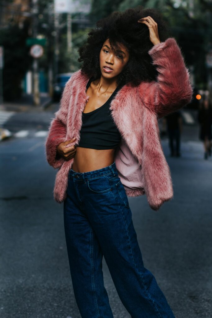
High Contrast
It is about pairing colours that are very different from each other.
- What it looks like: Black and white, a bright red against a neutral cream, bold patterns like stripes or polka dots.
- What it feels like: Energetic, bold, attention-grabbing, powerful.
- When to use it: When you want to make a statement, feel more lively, or draw attention to a specific part of your look. It’s the visual equivalent of speaking clearly in a crowded room.
Low Contrast
It is about pairing colours that are similar to each other.
- What it looks like: Different shades of beige and cream together (a monochrome look), soft pastels, a palette of greys and blues.
- What it feels like: Calm, structured, soft, sophisticated, gentle.
- When to use it: When you want to feel peaceful and focused, or when you want your presence to feel more understated and self-assured. It’s a quiet conversation you are having with yourself.
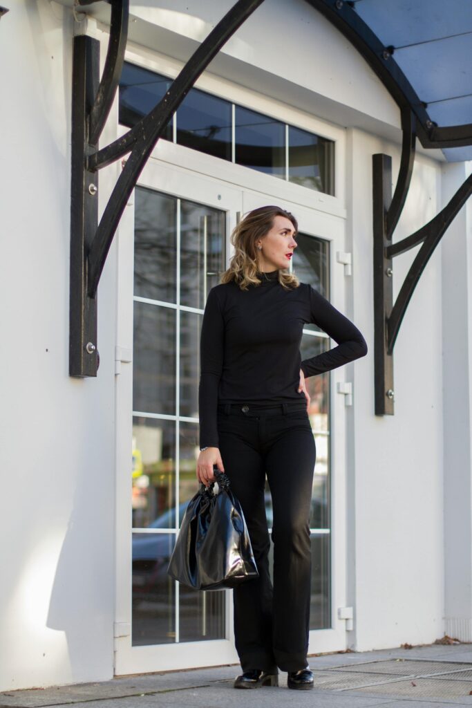
You are now in control. Want to make a statement with a new bag? Wear a low-contrast outfit and let the high-contrast bag do all the talking. This is how you move from getting dressed to consciously styling your energy.
5. The Psychology of Colour: How Your Clothes Affect Your Mood
Now that you understand the concepts, let’s put them to work. Think of your wardrobe not just as clothing, but as a toolkit for managing your energy and writing your story for the day. Colour is your most powerful instrument.
Here are a few scenarios to show how you can consciously use colour to support your inner world:
For the Day You Feel Anxious or Overwhelmed:
Your mind is already in overdrive. Don’t give it more work to do. Choose a low-contrast outfit—think monochrome blues, soft greys, or a palette of warm neutrals. These visually simple outfits require less cognitive processing, creating a pocket of calm and order. It’s like giving your brain a quiet space to breathe, helping you feel more grounded and in control.
For the Day You Feel Invisible or Unmotivated:
This is when you need to generate your own energy. A strategic pop of high contrast is your ally. You don’t need a full-blown neon suit. It could be a crisp white shirt under a dark blazer, a single bright red accessory against a neutral outfit, or a vibrant scarf. This sharp visual detail acts as a psychological nudge, prompting a response of alertness and presence in both yourself and others. It’s a way of telling the world, and yourself, “I am here.”
For an Important Meeting or Presentation:
Your goal is to project focused authority, not distraction. Use contrast with surgical precision. A well-tailored, low-contrast suit in charcoal or navy creates a baseline of seriousness. Then, add a single, high-contrast element—the aforementioned sharp white shirt. This combination communicates that you are deliberate and in command. Your message is the focus, and your clothing is the silent, powerful support structure.
For When You Need a Creative Spark:
Creativity often thrives on novelty. On these days, break your own rules. Try an unexpected colour combination from outside your usual palette. Pair a muted olive with a surprising lavender. This small act of visual disruption can help shake your brain out of its usual patterns, opening up new pathways for thought.
This is the essence of Emotional Styling. It’s not about following a chart; it’s about conducting a daily, conscious dialogue between your inner state and your outer expression.
6. Creating Your Sovereign Palette: A Step-by-Step Ritual
Your personal colour palette should be your emotional signature. It should represent who you are, how you want to feel, and the story you want to tell. This isn’t a test; it’s a gentle process of discovery.
1. Read Your Wardrobe.
Look at the things you have chosen for yourself- your clothes, your accessories, even the colours in your room. What patterns do you see? The pieces you love likely align with your desired moods. The pieces you avoid may clash with your core identity.
Go beyond “I like blue.” Ask why. Does blue make you feel calm? Authoritative? Creative? Is there a colour that makes you feel uneasy? The reason is a clue. Write all these down.
2. Define Your Emotional Goals.
How do you want to feel each day? How do you want to be perceived? Write it down.
Confident. Creative. Calm. Powerful. Approachable.
Now, assign colours to those feelings. What is the colour of confidence for you? It might be dark red for me, but it could be electric blue for you. This is deeply personal. Forget the rules. Feel the answer.
3. The Palette Curation.
From this exercise, select 5-7 core colours. These are your pillars. Add 2-3 accent colours—these are your statement-makers, the ones you use strategically to shift your energy or send a specific message. Remember, you can have as many colours as you want in your palette.
4. The Final Check
Gather the colours you’ve chosen. Lay them out. How do they feel together? How do they feel to you? Do they excite and soothe you at the same time? Do they feel at home?
If the answer is yes, congratulations. You haven’t just found some nice colours. You’ve found your super-colours. Your sovereign colour palette.
7. The Final Word: How to Go From Pretty to Powerful
Remember, colours are not a petty detail; they are a form of your identity. They are the first words you speak before you ever open your mouth. Your palette should make you feel good, not just look good. There is no need to please others when it comes to expressing your truest self. Stop asking which colours make you look pretty. Start asking which colours make you feel powerful. That is not just styling. That is sovereignty.
Your mirror is your diary. Today, you wrote the first entry on colour. But the story of your style has many chapters—the language of fabric, the power of a silhouette, the history in a single stitch. To continue this journey of self-discovery through style, subscribe below. We explore a new chapter every week.
